When it comes to transforming your space, never underestimate the power of a fresh coat of paint. And we’re not just talking about a single colour here, but the magic you can create with the right paint colour combinations. Picasso Paints, a trusted name in the world of colours, provides you with an array of timeless yet trendy paint colour options to choose from.
The right blend of colours can dramatically alter the mood of a room, making it feel warm, cool, spacious, or cosy. With Picasso Paints, you can effortlessly create the perfect ambience that reflects your personality and style. So, whether you’re looking to renovate an old room or planning to add some spark to your new house, Picasso Paints has something for everyone.
The Art of Colour Theory
To master the art of paint colour combinations, understanding colour theory fundamentals is essential. Colour theory is a practical guide that facilitates the creation of harmonious and visually appealing palettes. Central to colour theory is the colour wheel, which serves as a valuable tool for identifying complementary, analogous, and triadic colour relationships:
1. Complementary Colours: These are hues that sit opposite each other on the colour wheel, offering a dynamic and high-contrast look when combined. For example, pairing blue and orange can create a vibrant and lively atmosphere.
2. Analogous Colours: Analogous hues are found next to each other on the colour wheel, sharing a common colour. Such combinations yield a harmonious and cohesive feel, as seen in the mix of green, blue-green, and blue shades.
3. Triadic Colours: Triadic colour schemes consist of three evenly spaced hues on the colour wheel, offering a balanced yet visually stimulating effect. An example of a triadic palette includes the classic combination of red, yellow, and blue.
Creating Balance with Proportions and Undertones
Achieving a successful and visually pleasing paint colour combination extends beyond selecting harmonious hues. It’s crucial to consider proportions and undertones to create a balanced and sophisticated palette:
1. Proportions: A well-balanced colour scheme employs the 60-30-10 rule, designating 60% of the space to a dominant hue, 30% to a secondary hue, and 10% to an accent colour. This distribution of colours lends visual balance and depth to the room.
2. Undertones: Undertones are subtle, underlying shades within a colour. Identifying cool or warm undertones can make all the difference between a harmonious and a disjointed colour scheme. Ensure that your chosen hues share a similar undertone for a seamless visual effect.
Curating a Colour Palette Tailored to Your Space
When selecting your paint colour combination, it’s essential to consider the specific characteristics and function of the room:
1. Room Size: Colour can impact the perceived size of a space. Lighter hues can make small rooms appear more spacious, while darker shades can add warmth and cosiness to larger rooms.
2. Natural Light: Rooms with abundant natural light can showcase diverse palettes and bolder colours. However, spaces with limited light may benefit from lighter and warmer shades that reflect light more effectively.
3. Functionality: Consider the room’s purpose when choosing a colour combination. For example, calming shades like soft blue or green are suitable for restful spaces, while lively colours can energise communal areas.
Timeless and Trendy Colour Combinations to Inspire You
With a plethora of paint colour combinations at your disposal, the possibilities are endless. Here are a few timeless and trendy ideas to spark your imagination:
1. Monochromatic Magic: Monochromatic schemes combine various shades, tints, and tones of a single colour for a cohesive and sophisticated feel. A popular example is the use of various shades of soothing grey to create a serene atmosphere.
2. Nature’s Palette: Drawing inspiration from nature can lead to stunning paint colour combinations, like forest green paired with warm cream or deep blue combined with soft sandy beige.
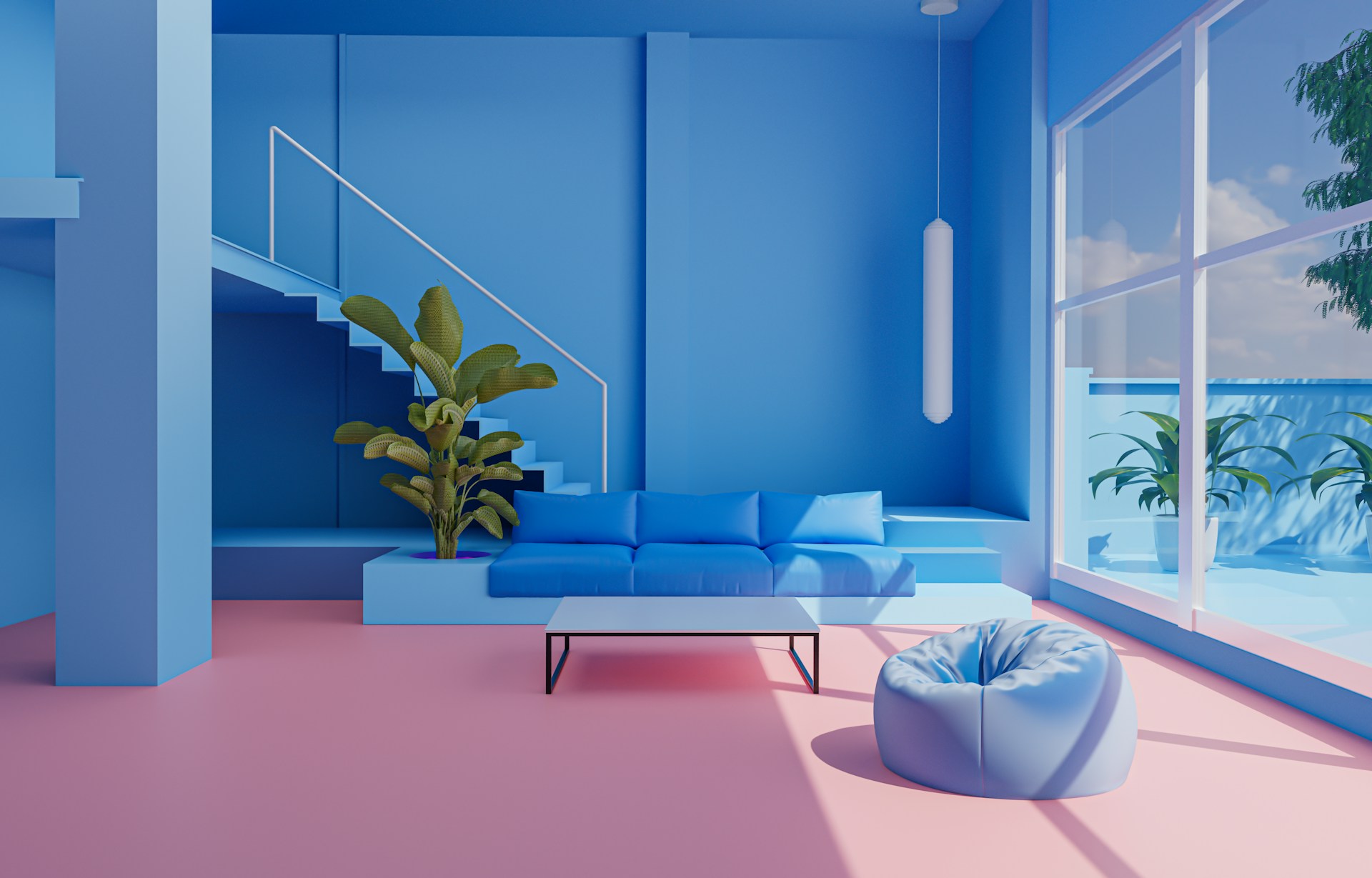
3. Bold and Beautiful: Make a statement with bold and memorable combinations, like classic black and white or rich emerald green and blush pink, for a space that exudes confidence and flair.
Transform Your Space with Picasso Paints
Discovering the perfect paint colour combination is a journey of inspiration and self-expression. As you explore the vast world of hues, tones, and tints, remember that the ideal colour scheme is one that resonates with your unique vision and elevates your living space to new heights.
At Picasso Paints, our painting contractors in Ottawa are here to help you bring your vision to life with our expertise in interior and exterior painting and an unwavering commitment to delivering exceptional results. Together, let’s create a one-of-a-kind environment that reflects your individuality and unique sense of style, while showcasing the remarkable power of paint colour combinations to evoke emotion, captivate, and inspire.
Leave a Reply